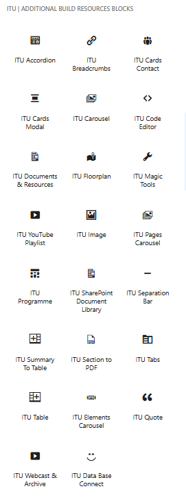
ITU Additional Build Resources Blocks
Blocks Collection

Br-Blocks – V. 28.5.0 – A collection of ITU-R blocks for WordPress.
- [Assets]
- Dropdown menu
- Translations patch
- Accordion
- Banner Hero
- Breadcrumbs
- Cards Contact
- Cards Modal
- Carousel
- Code Editor
- DB-Connect
- Document Viewer
- Documents & Resources
- Elements Carousel
- Filter By
- Floorplan
- Image
- Page to Carousel
- Programme
- Quote
- Section to PDF
- Separation Bar
- Survey
- SharePoint Document Library
- Summary To Table (RRB)
- Tables
- Tabs
- Webcast (Live, Archive and Clip)
- YouTube Playlist
- Magic Tools
- Search in a Table:
- Add Event Logo
- Modify Primary Logo
- Generate Table of Contents
- Replace Site Menu
- Add Button After Calendar Link in Banner
- Extract Element Content (+ add /md/ in same page or modal)
- Search in Accordion
- Add Image to Page Default Banner
- Requires at least WordPress v. 6.6
- Requires PHP 7.2
- GPL-2.0-or-later
Changelog
- [ Asset – Dropdown menu – JS / CSS ]
- [ Asset – ITU Translation Patch – Compatibility with Accordon and Tabs type hidden blocks ]
- ITU-R Accordion v. 1.2.6
- ITU-R Cards Contact v. 1.0.0
- ITU-R Cards Modal v. 1.2.0
- ITU-R Carousel v. 1.1.0
- ITU-R Code Editor v. 1.1.0
ITU-R Element-Carousel v.1.0.0 - ITU-R Floorplan v. 1.1.0
- ITU-R Image v. 1.0.0
- ITU-R Magic Tools v. 1.3.0
- Search in a Table
- Add Event Logo
- Modify Primary Logo
- Generate Table of Contents
- Replace Site Menu
- Add Button After Calendar Link in the banner
- Extract Element Content
- Search in Accordion
- ITU-R Separation Bar v. 1.0.0
- ITU-R Summary To Table v.1.0.0
- ITU-R Youtube Player v. 1.1.0
- ITU-R Tabs v. 1.0.0
Banner Hero
Banner Hero Overview
The Hero Banner Block is a powerful and visually engaging WordPress block designed to highlight key events, announcements, or strategic content at the top of a page. Built for flexibility and performance, it allows editors to create professional hero sections directly within Gutenberg while maintaining full control over layout, styling, and content.
Whether used for events, webinars, product launches, or institutional messaging, the Hero Banner Block delivers a polished and responsive experience across all devices.
Key Features
Flexible Content Structure
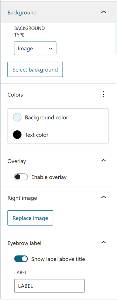
The block supports a clear content hierarchy including an optional eyebrow label, a prominent title, descriptive text, call-to-action buttons, and a supporting visual. Editors can easily structure messaging to guide user attention and improve engagement.
Advanced Layout Options
The Hero Banner adapts seamlessly to different screen sizes:
- Desktop: Uses a two-column grid with content on the left and a visual on the right for strong visual balance.
- Mobile: Automatically stacks elements for readability, placing buttons and imagery in a natural flow that extends the background without breaking the layout.
Spacing presets (small, medium, large) help maintain visual consistency across pages.
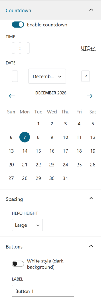
Integrated Countdown Timer
Perfect for events and time-sensitive announcements, the built-in countdown displays days, hours, minutes, and seconds in a clean card-based design.
- Automatically hides once the event has started
- Requires no manual intervention
- Fully responsive
This makes the block especially effective for promoting live sessions, registrations, or deadlines.
Customizable Call-to-Action Buttons
The block includes flexible button styling to match different visual contexts:
- Default style for standard layouts
- White variant for dark or image-based backgrounds
Buttons automatically adapt to mobile, becoming full-width for improved usability and touch interaction.
Built for Performance and Accessibility
The block follows modern development practices:
- Clean semantic markup
- Safe text formatting
- Optimized asset loading
- Responsive behavior by default
The result is a fast, accessible hero section that enhances both user experience and page performance.
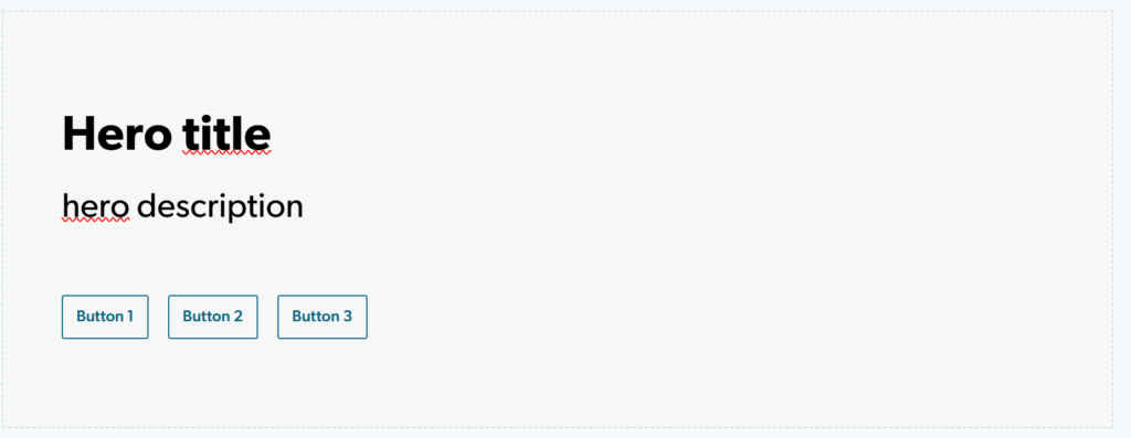
Hero title
hero description

Backend
Accordion
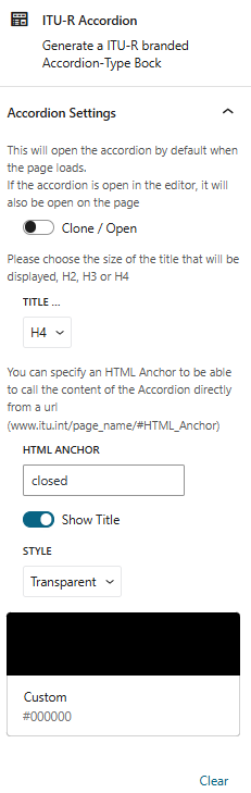
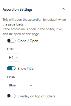
Accordion Overview
The Accordion Block is a versatile WordPress component designed to organize and display content in a compact, expandable format. It’s ideal for FAQs, detailed sections, or any content that benefits from a clean, collapsible layout.
Core Features:
- Flexible Content Support: Each accordion panel can contain any type of content—text, images, media, or even other blocks.
- Toggle via Anchor or Link: Panels can be opened or closed using anchor tags or clickable links, offering smooth navigation and interactivity.
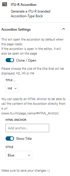
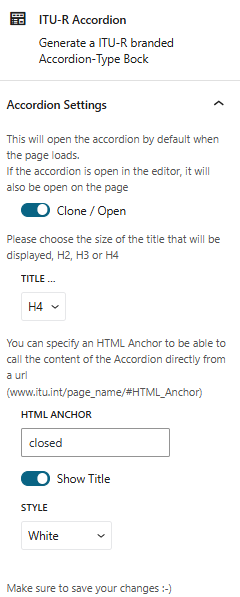
- Initial Display Options: Choose whether the accordion loads in an open or closed state, and whether the title is visible or hidden for full transparency.
- Style Variants: Available in three visual styles—Blue, White, or Transparent—to match your site’s aesthetic.
- Overlay Modes:
- Push Overlay: Shifts surrounding content when expanded.
- Cover Overlay: Displays over existing content without affecting layout.
This block is perfect for creating elegant, user-friendly sections that keep your pages tidy while still offering rich, accessible information
Opened accordion (title H4) (blue)
Closed accordion (title H4) #closed (White)
Transparent Accordion
Closed accordion (title H4) #closed (Transparent)
Backend Preview
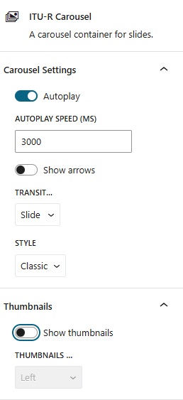
Carousel
Carousel Overview
The Carousel Block is a dynamic WordPress feature that allows users to showcase a series of images, each accompanied by a link and description. Ideal for highlighting products, portfolios, or visual stories, this block offers a sleek and interactive way to engage visitors.
Key Features:
- Image + Link + Description: Each slide can include a clickable image with a short caption or description.
- Display Modes: Choose between a classic slider or a stylish “book” layout for a more editorial feel.
- Blur Slider Option: Add a subtle blur effect to enhance visual transitions.
- Autoplay Functionality: Enable automatic slide rotation with customizable timer settings.
- Navigation Arrows: Optionally display arrows for manual navigation between slides.
Backend Preview
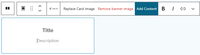
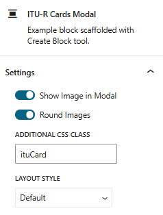
Cards Modal
Cards Modal Overview
The Cards Modal Block is a stylish and interactive WordPress component designed to display branded cards—styled in the ITU Card Icon format—with modal pop-up functionality. It’s ideal for showcasing speakers, team members, services, or any clickable content that reveals more details on demand.
Key Features:
- Card + Modal Display: Each card opens a modal window containing extended content, perfect for bios, descriptions, or media.
- Circular Image Option: Display round profile images inside the modal—especially useful for speaker presentations or team showcases.
- Image Reveal: Optionally show the card’s image within the modal for visual continuity.
- Layout Variants:
- Cards Grid: Traditional card layout for clean, modular presentation.
- Horizontal Layout: Displays image on the left with content on the right, ideal for more editorial or profile-style modals.
This block offers a sleek way to combine branding, interactivity, and content depth—perfect for modern websites that want to keep things both elegant and informative.

Card Modal
opens a modal
Card Modal
opens a modal
Modal Content
🙂
Backend Preview
Cards Contact
Cards Contact Overview
The Cards Contact Block is a practical and visually appealing WordPress component designed to display individual contact cards. It’s perfect for showcasing team members, speakers, or any individuals whose details need to be easily accessible.
Key Features:
- Contact Details: Each card can include personal information such as name, role, phone number, email, and other relevant contact data.
- Photo Integration: Add a profile image to personalize each card and enhance visual recognition.
- Title & Description: Include a clear title and a rich-text description that supports links—ideal for bios, social media, or external resources.
This block is ideal for directories, team pages, speaker listings, or any layout where clear, clickable contact information is essential.
Backend Preview
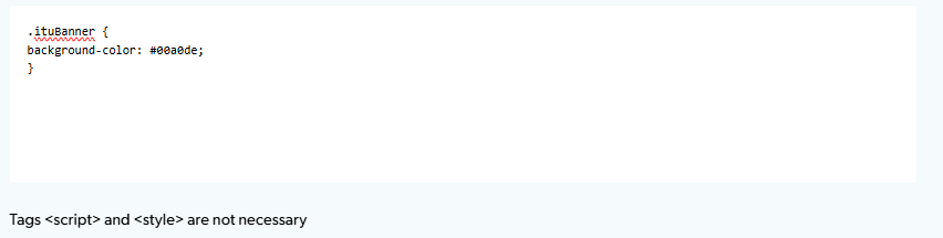
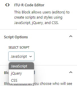
Code editor
Code editor Overview (print screen)
The Code Editor Block is a specialized WordPress component designed to preserve and display code snippets without interference from WordPress’s default content filtering. It was originally developed to prevent tag stripping—especially style-related tags—when pages are edited by users without Super Admin privileges.
Key Features:
- Tag-Safe Editing: Prevents WordPress from removing or altering code tags, ensuring that scripts and styles remain intact even when edited by non-Super Admins.
- Language Selection: Supports three languages—jQuery, Java, and CSS—allowing users to format and display code snippets clearly and safely.
- No Tags Required: Code can be entered directly without wrapping it in HTML tags, simplifying the editing process and reducing errors.
This block is ideal for developers, technical writers, or site editors who need to share clean, executable code without risking unwanted formatting or tag removal.
Backend Preview
Document and Resources
Document and Resources Overview
The Document and Resources Block is a practical WordPress component designed to showcase downloadable files in a clean, organized format. It’s perfect for sharing reports, guides, templates, or any type of resource with clear visual cues.
Key Features:
- Custom File Icons: Choose from various icons (PDF, Word, Excel, etc.) to visually represent each document type.
- Layout Options: Display resources in either a grid or list format to suit your page design.
- Column Control: Select the number of columns—2, 3, or 4 cards per row—for optimal spacing and readability.
This block is ideal for resource libraries, documentation hubs, event pages, or any section where users need quick access to downloadable content.
Documents
Documents
Documents
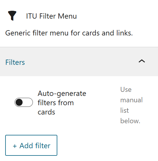
Filter By <br>(for ITU Cards Link)
Filter by Overview
Key Features:
Backend Preview
Element Carousel
Element Carousel Block Overview
The Element Carousel Block is a powerful and flexible WordPress component that allows you to display a carousel containing virtually any type of content. Whether you’re showcasing card groups, accordions, full pages, or custom layouts, this block brings motion and interactivity to your site.
Key Features:
- Supports All Content Types: Easily embed cards, accordions, page sections, or custom blocks within each carousel slide.
- Navigation Controls: Choose to display navigation arrows for manual control—or hide them for a cleaner look.
- Autoplay & Loop Options: Enable automatic slide rotation with a customizable timer, and set the carousel to loop for continuous playback.
- Animation Styles: Select between two transition effects:
- Fade: Smooth crossfade between slides.
- Slide: Classic sliding motion for dynamic transitions.
quote message

Card Icone
ITU Theme 2.2
Card Icone
ITU Theme 2.2
Card Icone
ITU Theme 2.2
ITU-R Cards Modal
This block is ideal for creating immersive, scrollable sections that elevate user experience and keep your content engaging and organized.
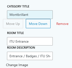
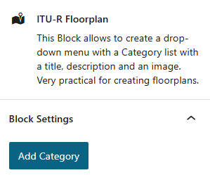
Floor Plan
ITU-R Floor Plan Overview
The Floor Plan Block is a visual WordPress component designed to showcase interior layouts through categorized images and descriptive content. It’s ideal for presenting building plans, venue maps, or room overviews in an organized and engaging format.
Key Features:
- Image + Description: Display photos of rooms or areas with accompanying text to provide context or details.
- Category Management: Create custom categories to group rooms or sections by type, function, or location.
- Room Titles & Descriptions: Add a clear title and detailed description for each room, making it easy for visitors to understand the layout and purpose of each space.
This block is perfect for real estate listings, event venues, hotels, or any site that needs to visually communicate spatial organization and room details.
Montbrillant
Montbrillant reception
Entrance
Badges / ITU Shop
ITU Tower
ITU Tower Building
ITU Tower Entrance
Varembé
ITU Varembé Exit
Entry and exit with Self-Badging
Backend Preview
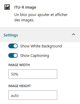
Image
Image Overview
The Image Block is a sleek WordPress component designed to display a single image that opens in a modal when clicked. It’s perfect for showcasing visuals with enhanced focus and optional descriptive context.
Key Features:
- Modal Display on Click: Clicking the image opens a larger view in a modal, ideal for highlighting details or creating immersive visual experiences.
- Optional White Background: Add a clean white background to the modal for better contrast and readability.
- 📝 Caption Support: Include a caption to describe or contextualize the image, with customizable font size for better visual hierarchy.
- 📐 Size Control: Adjust the image’s width and height to fit your layout needs.
- 🎨 Caption Layout Options:
- Below the Image: Traditional caption placement for clarity.
- Overlay Layout: Display the caption directly over the image for a modern, editorial feel.
This block is ideal for galleries, portfolios, product showcases, or any content where visual storytelling takes center stage.

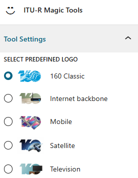
Magic Tools
Magic Tools Overview
The Magic Tools Block is a multifunctional WordPress component that brings together a suite of utilities designed to enhance page customization, branding, and user experience. Each tool serves a specific purpose, making it easier to manage content, visuals, and interactivity across your site.
Included Tools:
- Search in a Table: Enables keyword search within WordPress or Flexitable tables using a specified table anchor.
- Add Event Logo: Adds a secondary logo to the left of the primary logo—ideal for event branding like “160 Years.”
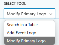
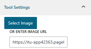
- Modify Primary Logo: Allows you to change the main logo on a specific page without affecting the global site logo.
- Generate Table of Contents: Automatically creates a table of contents based on the page’s H2 headings.
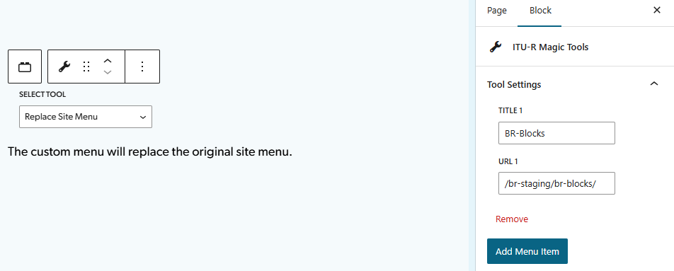
- Replace Site Menu: Replaces the default site menu on a specific page, offering tailored navigation.
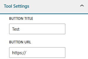
- Add Button After Calendar Link in Banner: Inserts custom buttons into the event banner, right after the calendar link.
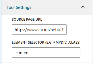
- Extract Element Content: Retrieves content from a specified URL using an element ID or class. Includes built-in CSS styling to match WordPress branding for high-visibility sites.
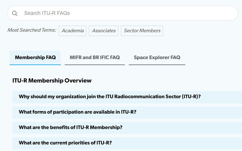
- Search in Accordion: Enables keyword search within accordion blocks, hides irrelevant sections, highlights matches, and optionally displays trending search terms.
- Add Image to Page Default Banner: Adds a background image to the small default banners used in the theme.
This block is perfect for editors and site managers who need advanced control over layout, branding, and content visibility—without diving into complex code.
Search in a Table:
Search in a Table:
| test 1 | 1 3 4 5 |
| test 2 | 2 6 7 8 9 |
Add Event Logo
Magic Tools Add Event Logo (3rd)
Modify Primary Logo
Magic Tools Modify Primary Logo
This

to (with active logo event)

Generate Table of Contents
Generate Table of Contents
Replace Site Menu
Add Button After Calendar Link in Banner
Welcome to

Extract Element Content
Search in Accordion
Add Image to Page Default Banner
Programme
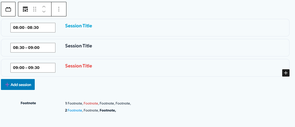
Programme Block Overview
The Programme Block is a versatile scheduling feature designed to structure and display event sessions in a clean, dynamic format. Ideal for conferences, workshops, or multi-part events, this block ensures that session details remain organized and visually engaging.
Key Features:
- Optional Footnote Section: Add a footnote area with multiple bullet points. This section can be toggled on or off depending on the need
- Auto-Sorting Sessions: Sessions are automatically arranged chronologically. Any addition, deletion, or time change instantly updates the order.
- Flexible Content Zone: Each session includes a customizable content area where users can insert text, images, links, or any other block elements.
- Highlighting Capability: Specific words or phrases can be emphasized for better visibility or thematic focus.
- Color Themes: Three default color schemes are available—blue, red, and black—to match different branding or mood settings.
- Footnote, Footnote, Footnote, Footnote,
- Footnote, Footnote, Footnote,
Backend Preview
Page to Carousel
Page to Carousel Overview
The Page-carousel block is a custom Gutenberg block that displays a list of pages or custom items as:
- a horizontal card strip (grid mode) with:
- scrollable cards
- arrows at the bottom right
- a blue progress bar (
#009cd6)
- or a classic full-width carousel (one slide at a time, with arrows + optional autoplay)
It’s designed to be:
- Editor-friendly – cards preview in the editor almost exactly like on the frontend
- Configurable – items can come from WordPress pages or fully custom content
- Modern UX – drag-to-scroll, momentum, snapping, wheel
Key Features:
- Display panel
- Selected item panel
- Add page from WordPress
Quote
Quote Overview
The Quote Block is a branded WordPress component designed to highlight impactful messages or testimonials in a visually elegant format. Styled with ITU branding, it’s perfect for showcasing quotes from speakers, team members, or partners.
Key Features:
- Stylized Quotation Display: Messages are presented within quotation marks, following ITU’s visual identity.
- Photo Integration: Add a profile image to personalize the quote and enhance credibility.
- Speaker Details: Include the person’s full name, role, and company to provide context and attribution.
- URL Support: Embed clickable links directly within the quote text for added interactivity or references.
This block is ideal for testimonials, keynote highlights, featured insights, or any content that deserves to stand out with a professional touch.
Telecommunications/ICT are a key enabler to achieve the Sustainable Development Goals (SDGs) and to build a world where social, economic, environmental, and technological development is sustainable and available for everyone, everywhere. | Read more >

The United States Government Accountability Office’s recent in-space servicing report paints a nearly 70-year-old picture: despite decades of progress in both space technology and environmental preservation, satellites are still treated as disposable. | Read more >

China’s CSCN constellation has started taking shape, with nearly a hundred satellites operational in low Earth orbit (LEO) by the end of August 2025. Like other major LEO systems, it is poised for rapid growth to support satellite communication services globally. | Read more >

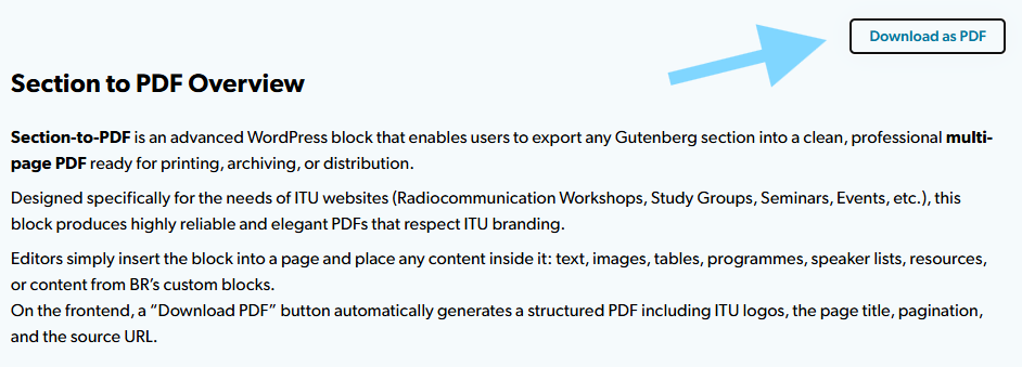
Section to PDF
Section to PDF Overview
Section-to-PDF is an advanced WordPress block that enables users to export any Gutenberg section into a clean, professional multi-page PDF ready for printing, archiving, or distribution.
Designed specifically for the needs of ITU websites (Radiocommunication Workshops, Study Groups, Seminars, Events, etc.), this block produces highly reliable and elegant PDFs that respect ITU branding.
Editors simply insert the block into a page and place any content inside it: text, images, tables, programmes, speaker lists, resources, or content from BR’s custom blocks.
On the frontend, a “Download PDF” button automatically generates a structured PDF including ITU logos, the page title, pagination, and the source URL.
Key Features:
Export Gutenberg sections to PDF
Automatically converts a specific portion of the page into a PDF — supporting:
- BR custom blocks
- images
- tables
- lists
- dynamic content
Full multi-page support
Content is sliced cleanly:
- no duplication
- no broken cuts
- automatic pagination
- layout preserved
Professional ITU Header
Every PDF page includes:
- the main ITU-R logo
- the event/workshop/sector logo
- the page title
All aligned on a single row with preserved proportions.
Automatic Footer
Each PDF page contains:
- the original page URL
- the page number (
Page 1,Page 2, …)
Zero backend dependency
Everything runs client-side:
- no server calls
- no external PDF service
- no additional plugins required
- works on all ITU WordPress sites
Separation Bar
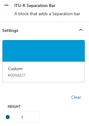
Separation Bar Overview
The Separation Bar Block is a minimalist WordPress component designed to add a full-width vertical bar across the page. It’s perfect for visually dividing sections or creating clean breaks in layout.
Key Features:
- Full-Width Display: The bar spans the entire width of the page for maximum visual impact.
- No Vertical Padding: The block renders without any top or bottom padding, ensuring seamless integration between sections.
This block is ideal for creating elegant visual separators in landing pages, content layouts, or design-focused templates.
Backend Preview
SharePoint DL<br>Document Library
SharePoint Document Library
…
Key Features:
…
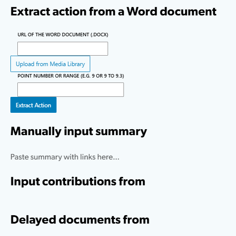
Summary to Table <br>(for RRB)
Summary to table Overview
The Summary to Table block allows users to extract hyperlinks from a Word document by specifying the relevant section or topic. It also supports manual insertion of paragraphs if needed.
Key Features:
- Modern Styling: Modal windows are styled using a modern WordPress design for a clean and professional look.
- Link Extraction: Automatically pulls links from selected parts of a Word document.
- Manual Input: Users can manually add paragraphs to the table if desired.
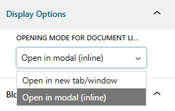
- Frontend Display: Links can be opened either in a modal window or a new browser tab.
Input contributions from
Delayed documents from
Backend Preview
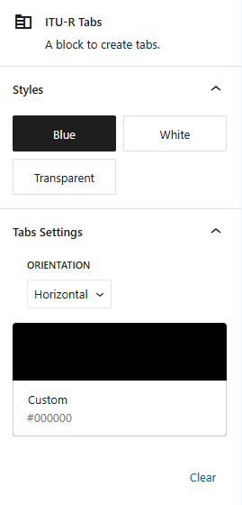
Tabs
Tab Block Overview
The Tab Block is a highly flexible WordPress component that organizes content into clean, interactive tabs. It’s ideal for structuring large sections of information while keeping the layout user-friendly and visually appealing.
Key Features:
- Supports All Content Types: Each tab can contain text, images, media, or even other blocks.
- Unlimited Tabs: Add as many tabs as needed to structure your content effectively.
- Anchor Support: Assign unique anchors to each tab for direct linking and smooth navigation.
- Style Variants: Choose from three visual styles—Blue, White, or Transparent—to match your site’s design.
- Layout Options: Display tabs either horizontally or vertically depending on your layout preference.
- Default Tab Selection: Set which tab should be displayed by default when the page loads.
This block is perfect for FAQs, documentation, multi-step guides, or any content that benefits from a tabbed interface with full customization.
Backend Preview
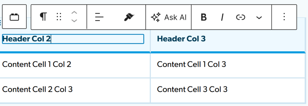
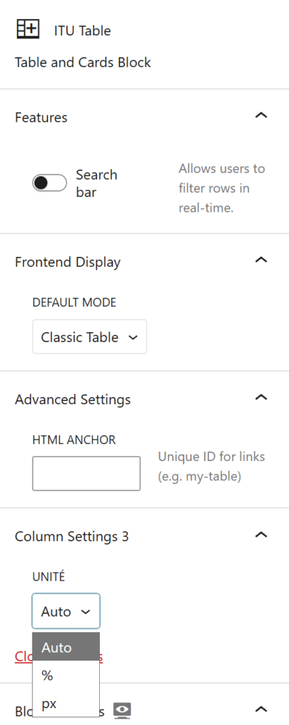
Table
Table Overview
The Table Block is a flexible and modern WordPress block designed to display structured data in a clean, responsive, and highly customizable way. It allows editors to build advanced tables directly in Gutenberg while offering an adaptive frontend experience that works seamlessly across desktop and mobile devices.
Ideal for schedules, lists, directories, comparison tables, or any content that benefits from a structured layout, the Table Block combines editorial simplicity with powerful display options.
Key Features
- Classic Table Editing in the Backend
In the editor, the block always behaves like a traditional table, making it easy to understand, edit, and maintain. Rows and columns are clearly defined, ensuring a familiar and predictable editing experience. - Table or Cards View on the Frontend
On the frontend, the table can be displayed either as:- a classic table view (ideal for desktop and data-heavy layouts), or
- a cards view (optimized for mobile and narrow screens).
This switch can be automatic (responsive) or user-controlled via a small toggle above the table.
- Responsive Cards Layout
In cards mode, each row is transformed into a card, with column headers automatically injected as labels. This makes complex tables readable and elegant on mobile without duplicating content. - Column Consistency & Alignment
Cells belonging to the same column always keep consistent widths and spacing in table view, ensuring a clean and professional layout regardless of content length. - Optional Pagination for Cards
When displaying large datasets in cards mode, pagination can be enabled to keep the layout lightweight and user-friendly. - Dynamic & Future-Proof Rendering
The frontend behavior adapts automatically to DOM changes (patterns, dynamic blocks, AJAX, Gutenberg rendering), ensuring reliable output in all contexts.
Use Cases
- Any structured content that needs to remain readable on mobile
Header Col 1
Header Col 2
Header Col 3
Content Cell 1 Col 1
Content Cell 1 Col 2
Content Cell 1 Col 3
Content Cell 2 Col 1
Content Cell 2 Col 3
Content Cell 3 Col 3
Backend
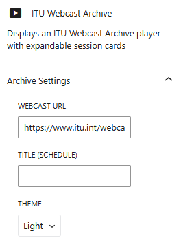
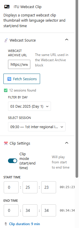
Webcast <br>(Live, Archive and Clip)
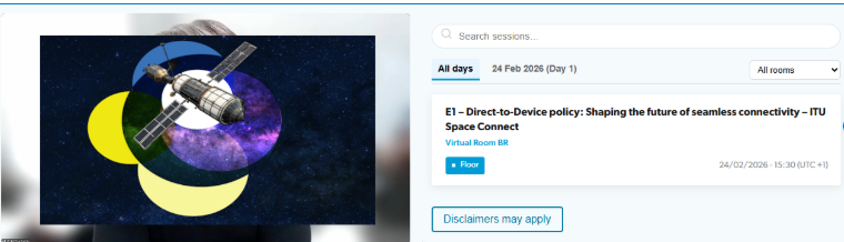
Webcast Overview
Custom WordPress (Gutenberg) block that embeds an ITU Webcast player directly into any page. It fetches a remote schedule from a given URL, parses the session data, and lets visitors browse and play back meeting recordings — or watch live streams — without ever leaving the site.
The block ships with a two-column layout: a video player on the left and a filterable schedule panel on the right. When no video is selected, a branded placeholder with the ITU Webcast logo invites users to pick a session.
Key Features
Live Streaming & Archive Playback
The player handles both live and archive content seamlessly. For live streams it automatically rewrites .mp4 URLs into HLS manifests (index.m3u8) and uses hls.js for browsers that don’t support HLS natively (Chrome, Firefox, Edge), while falling back to native playback on Safari / iOS. Archive recordings are served as regular MP4 files. Switching between languages on the same session preserves the current playback position so viewers don’t lose their place.
Remote Schedule Parsing
On page load the block fetches the HTML page at the configured URL, parses the embedded <table> of sessions, and converts each row into a structured card. Each card displays the session title, room, date/time, and a set of language buttons. If the remote page doesn’t contain a recognised table, a friendly fallback message is shown instead.
Filtering & Search
The schedule panel offers several ways to narrow down sessions:
- Search bar — free-text filter that matches session titles.
- Day tabs (desktop) / Day dropdown (mobile) — filter by conference day.
- Room selector — filter by meeting room.
- Session selector — filter by session number (extracted automatically from titles like “Session 3”).
Each of these UI elements can be toggled on or off from the block’s Inspector settings, giving editors full control over the interface complexity.
Playback State Persistence
The block saves the viewer’s playback position to sessionStorage every 5 seconds. When switching between languages (e.g. from English to French), the new stream resumes from where the previous one left off. Browser back/forward navigation is also wired up through history.pushState, so pressing Back closes the player and returns to the schedule.
Multi-language Support
Each session can expose multiple language streams (Original, English, French, Spanish, etc.). Language buttons are decoded from Base64-encoded URLs embedded in the source HTML. Clicking a language tag starts playback; clicking it again stops the player.
Live
Archive
EN: The interpretation of proceedings serves to facilitate communication and does not constitute an authentic or verbatim record of the proceedings. Only the original speech is authentic.
FR: L’interprétation des interventions est destinée à faciliter la communication et ne constitue un compte rendu authentique ou in extenso desdites interventions. Seules les interventions prononcées dans la langue d’origine font foi.
ES: La interpretación de las intervenciones sirve para facilitar la comunicación, pero en modo alguno constituye una grabación auténtica o literal de las mismas. Sólo las intervenciones originales son auténticas.
RU: Устный перевод на заседаниях служит для того, чтобы содействовать коммуникации, и не является аутентичной или стенографической записью заседаний.
ZH: 在会议进行中提供翻貙是为方便交流,不能将其视为会议实况记录或逆字记录。应以发言原文为准。
AR: الترجمة الشفوية في المداولات الغرض منها تسهيل التواصل ولا تشكل أي محضر ذي حجية.
If you experience issues, contact: webcast@itu.int
Backend
Clip
Backend
Youtube Playlist
ITU-R Youtube Playlist
The YouTube Playlist Block is a branded WordPress component that allows you to create and display custom playlists of YouTube videos. Designed with ITU branding, it offers a clean and engaging layout for showcasing video content.
Key Features:
- Custom Playlists: Build personalized collections of YouTube videos to suit your content needs—ideal for events, tutorials, or featured series.
- Title Customization: Add a custom title to introduce or label your playlist.
- ITU Branding: Styled to match ITU’s visual identity for consistency across your site.
- Split Layout: Displays the video player on the left and the playlist of video thumbnails on the right for intuitive navigation.
This block is perfect for media hubs, event pages, learning portals, or any site that wants to present curated video content in a professional and user-friendly format.
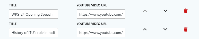
WRS-24 Opening Speech
History of ITU’s role in radiocommunication development
ITU-R Basics and Facts
Radio Regulations Board
Radiocommunication Study Groups
World Radiocommunication Conference (WRC) Preparatory process
The ITU Radio Regulations
ITU Radio Regulations Software Tools
Network of Women for WRC27 (NOW4WRC27)
Overview of terrestrial services
Frequency Plans for Terrestrial Broadcasting Services
Frequency plans and coordination procedures for non- broadcasting services
Terrestrial Stations Notification of frequency assignments for recording in the Master Register and Plans
Harmful interference (Terrestrial services)
The main outcomes of WRC-23 related to terrestrial services
The ITU Radio Regulations
Broadcasting trends and Regulation
Overview of Space Services and Regulatory Framework
Regulatory Process for Satellite Networks/ Systems Subject to Coordination
Regulatory procedures for satellite systems that are not subject to coordination and Earth stations
Introduction to BSS & FSS Plans
Receivability of Space Notices
Technical and Regulatory Assistance by The Bureau
Space Sustainability, Monitoring and Interference Reporting (SIRRS)
WRC-23 Results — Space related
BR IFIC – Hub and Access Policy
BR IFIC — Terrestrial Services
Maritime Communications
ITU Maritime Publications and Maritime mobile Access and Retrieval System (MARS)
Harmful Interference to Terrestrial Services (HITS)
Cost Recovery for Satellite Network Filings
BR IFIC (Space Services) and ITU Space Website
e-Submission of Satellite Network Filings / e-Communications
BR Space Software and Databases
Backend Preview